D.C. Crime Dashboard


The application can be viewed HERE, with the GitHub repo available HERE.
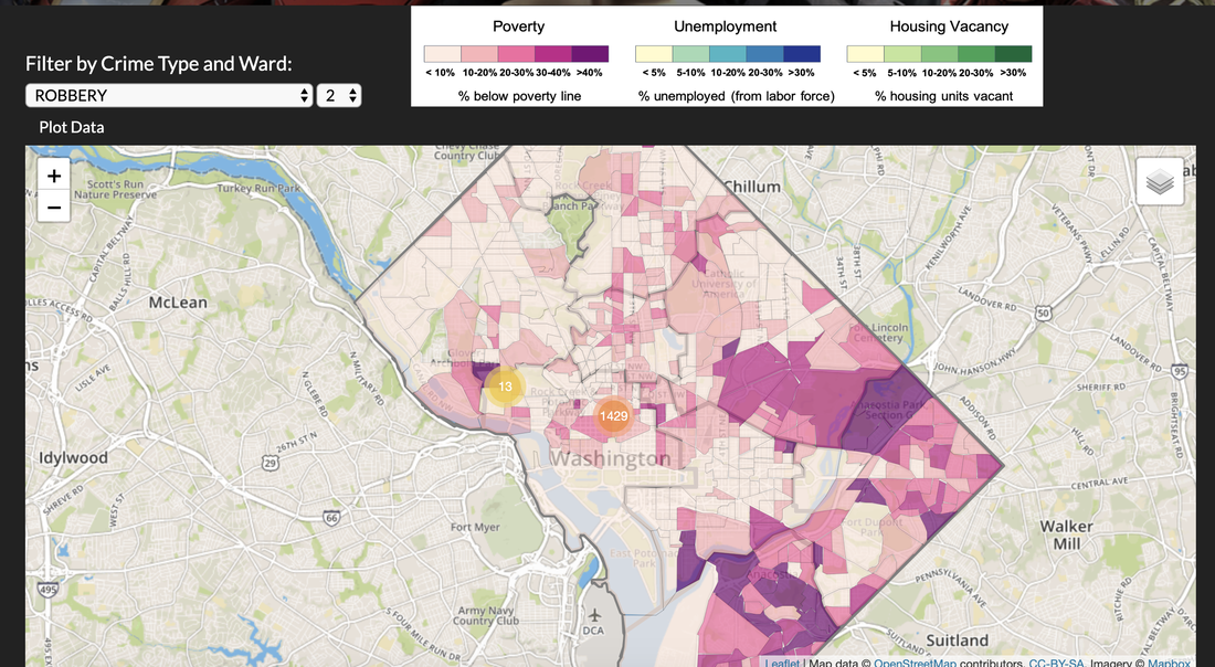
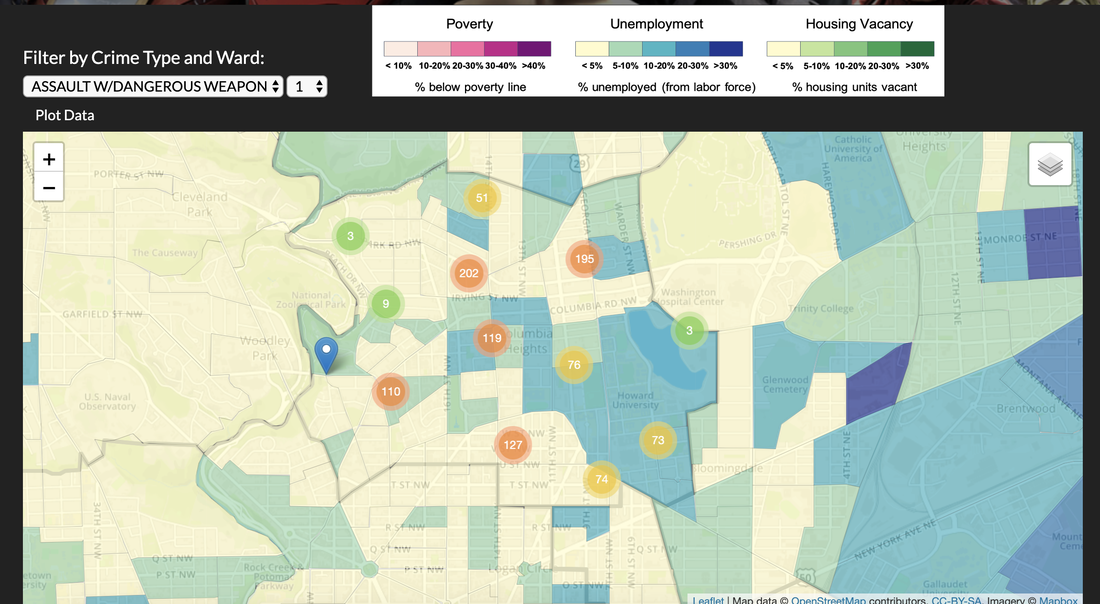
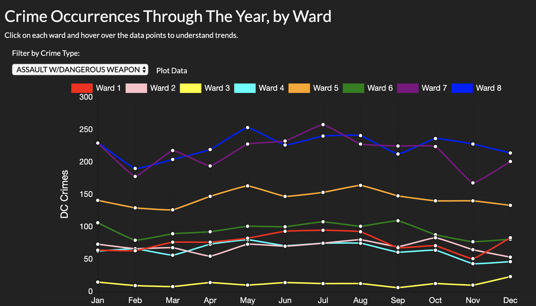
Jimmy White, Reena Desai, Mario Cosby, and myself built the D.C. Crime Data Dashboard for our GW Data Analytics Boot Camp final project. This web application allows for the visualization of spatial and temporal trends in five years of violent crime data for Washington, D.C. The application consists of an interactive map for displaying demographic data overlaid with crime by type and D.C. Ward, a series of "time wheels" visualizing time-of-day frequencies in crime, a line graph for comparing crime frequencies by month, and an exploration of machine learning and regression techniques to investigate possible explanations of crime patterns. My work on this project focused on back-end data processing, configuring the interactive map, and performing the regression analyses.
On the back-end, the application uses AWS-deployed databases of crime and demographic data. Data processing steps are performed in Python and documented in two Jupyter Notebooks. SQL Alchemy and Flask are used to establish and send data to various endpoints in the application. Starting from a Bootstrap template, the front-end consists of interactive visualizations created with D3, Leaflet, Moment.js, and Chart.js JavaScript libraries. The full application is deployed to Heroku.